Work Accessibility on sitimm.org
Accessibility case · sitimm.org · 2026
Making accessibility hard to break.
sitimm.org serves a union of 70,000 members in 8 languages. This is what failed, the WCAG criterion behind each failure, how it was fixed, and the checks that keep it fixed.
- My role
- The target, the rules and the review. AI agents wrote the fixes; a second model reviewed them.
- Target
- WCAG 2.2 AA
- Checks
- 30 lint rules and one of my own, typed components, keyboard tests, axe on six flows in light and dark
- Languages
- Every label and announcement in 8
Screen
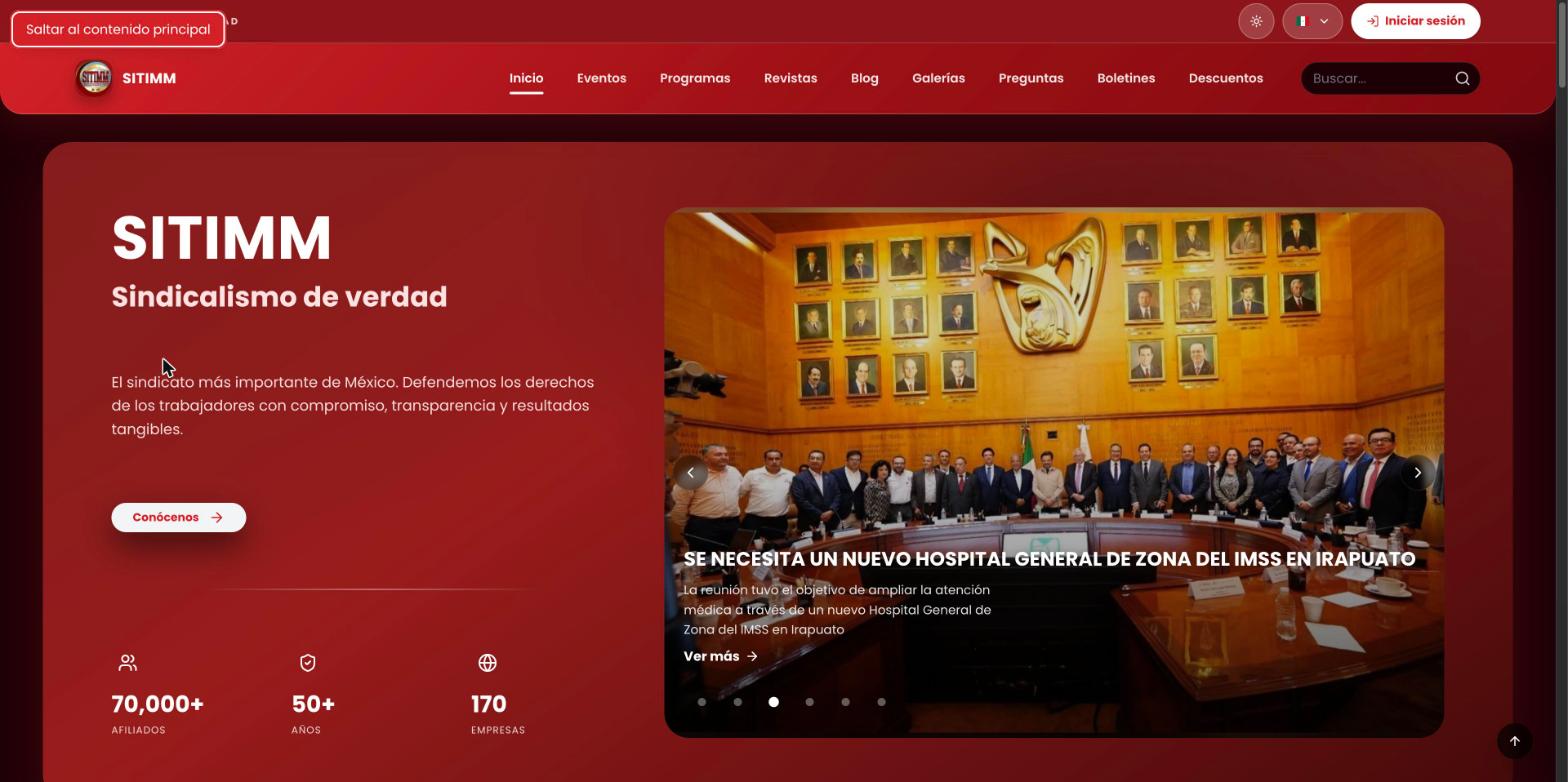
Why this one
At Drift I owned accessibility for three years and did most of it by hand. At SITIMM the job changed: I'm one engineer directing AI agents, and I can't read every line they write. So the work became making the wrong thing hard to ship.
Before and after
| What failed | WCAG | Before | After |
|---|---|---|---|
| A dialog named “Close” | 4.1.2 Name, Role, Value | While a magazine loaded, the dialog's only name was its close button's label. A screen reader announced the whole dialog as “Close”. | It has a real name from the first frame. The shared modal now requires a title in its types, so a dialog with no name doesn't compile. |
| Radio groups that weren't | 2.1.1 Keyboard 4.1.2 Name, Role, Value | Every option was its own Tab stop and the arrow keys did nothing. | One Tab stop. Arrows move and select, and wrap around. Space selects. |
| A combobox in name only | 4.1.2 Name, Role, Value 4.1.3 Status Messages | The company search called itself a combobox but had no arrow keys. Picking a result dropped focus on the page body. | A plain text field, a status line that says “searching”, “5 found” or “no results”, and a list of buttons. Focus returns to the field. |
| Focus lost after signing in | 2.4.3 Focus Order | The button that opened the sign-in dialog was gone once you signed in, so focus fell to the top of the page. | Focus moves to the account menu that took its place. |
| A heading that was decoration | 1.3.1 Info and Relationships 1.4.3 Contrast | The 404 page's main heading was a giant, pale “404”. The real message was a second-level heading. | The number is hidden from assistive technology. The message is the main heading. |
| Silent form errors | 3.3.1 Error Identification 4.1.3 Status Messages | The membership form showed errors without moving focus or announcing them. | Focus goes to the first invalid field. Errors and success are announced. |
| A step nobody announced | 3.3.2 Labels or Instructions 4.1.3 Status Messages | Deleting an account asks for the password again. A screen reader user got a new field with no explanation. | The field describes the extra step before it appears, and the step is announced when it does. |
| A close button lost on dark photos | 1.4.11 Non-text Contrast | A dark close button sat on top of cover photos. | A white X on a dark scrim with a white ring: at least 5.7:1 on any photo. |
| Reduced motion meant no cue | 2.3.3 Animation from Interactions (AAA) | With reduced motion on, the hero text switched language with no transition at all. | A fade with no movement. Less motion, and still a cue that something changed. |
What keeps it fixed
- Lint30 accessibility rules run on the whole repo before every push, plus one I wrote after the scan below: the brand red can't be used as a text colour.
- TypesA dialog can't be built without a name. The compiler says no before a reviewer has to.
- Keyboard testsEach picker is tested for Tab, arrows, wrapping and Space. Sign-up runs end to end with the keyboard only.
- axeA test loads six flows in a real browser, in light mode and again in dark, and fails on any serious or critical violation. It runs before every push that changes the interface. Its list of exceptions is empty.
- One focus ringEvery interactive element shares one visible focus style, shown to keyboard users.
Then I scanned production
For this page I scanned production myself, on 20 and 21 November 2026: 27 public pages, in light and dark mode, with axe-core and the WCAG 2.0 to 2.2 rules, levels A and AA. I expected a clean report. I didn't get one.
| What the scan found | Where | Measured |
|---|---|---|
| The brand red used as a text colour on dark surfaces | The cookie banner on every page, the 404 links, program and collection pages | 3.2 to 3.8:1. AA asks for 4.5:1. |
| The same red on tinted backgrounds, in light mode | Program and collection pages | 4.1 to 4.4:1 |
| The search highlight in dark mode | Search results | 1.5:1 |
| White text on coloured type badges | Search results | Six of seven colours under AA. The worst: 2.2:1. |
| Grey text tuned against white, on a page that is pale pink | Blog and gallery pages, search | 4.4:1 |
| Filter labels in dark mode | Magazines | 4.1:1 |
| Controls whose name left out text printed on them | 113 controls on six pages | 2.5.3 Label in Name. Reported only by the newer axe version in the repo. |
| Headings | The home page and four others | Two top-level headings on the home page. A skipped level on four pages. |
Why nothing caught it. The list above describes the test as the pull request leaves it. The day I scanned, it only ran in light mode, on four flows, and only in CI. CI had been off since September. When I ran it by hand it could not even start: the browser it needed was not installed. Had it started, it would have failed on a rule that a dependency update had added. The check was easy to break, and it had broken without a sound.
What I changed. One pull request, the next day. It is in review: sitimm.org gets these fixes when it merges.
- One cause, fixed once. Red text now uses a colour token that changes with the theme. That was 140 uses in 65 files, and the lint rule keeps the old one out.
- Cards. A card that was one big link now has its link on the title, stretched over the card. A card that was one big button is now a box with a button over it, so the heading inside is a real heading again.
- The test. Six flows, both themes. It waits for the theme and the cookie banner before it measures, because both arrive after the page loads. It adds about a minute to a push.
- Proof that it works. I put three of the old failures back. The six dark checks failed, on 1, 4 and 7 elements. The six light checks passed, which is exactly why the old test never saw them.
On the pull request's preview build, the same 27 pages come back clean in both themes: no violations, one top-level heading per page, no skipped levels.
I changed my mind about the “404”. The page shows a giant, pale “404” above the real message. In the first draft of this page I defended it as decoration, exempt from contrast. Then I made it readable. Hiding something from a screen reader doesn't hide it from a person with low vision.
Left for a person. axe could not measure text over gradients and photos, between 54 and 182 elements per page. Those need checking by eye and with a contrast picker.
What automated checks can't tell me
- They find about half. The rest needs a keyboard, a screen reader and time. The focus lost after signing in was caught in review, on the third pass. No scanner flags that.
- A scanner is a version. The same pages passed one release of axe and failed the next. A clean report says which rules ran, not that the page is accessible.
- Not verified yet: the map of union offices and the magazine's PDF reader.
- Next: the test covers six flows. The other 21 pages were clean in the scan, and nothing but the lint rule keeps them that way.
Want the details?
I can walk you through any of these fixes, the tests behind them and what I'd check next.